Capturing valuable leads remains a cornerstone of business success. Forms that you can place on your website, chatbot, and even email blasts play a crucial role in this process, acting as a bridge between casual website visitors and engaged potential customers. However, simply placing a form on your website isn't enough. To truly maximize your lead generation efforts, you need to craft forms that are both user-friendly and strategically designed to entice visitors to fill them out.
Table of Contents
- The Power of Forms
- Essential Form Features
- Crafting Compelling Form Content
- Optimizing Form Placement
- Advanced Techniques for Increased Conversions
- Common Form Mistakes to Avoid
- Turning Website Visitors into Loyal Customers
- Ready to Unlock the Power of Effective Forms?
- Conclusion

The Power of Forms
Forms are more than just lead capture tools. They play a vital role in various aspects of your digital marketing strategy.
Lead Generation
Forms are the primary tool for collecting valuable information from website visitors, allowing you to build targeted email lists and nurture potential customers.
Market Research
Forms can be used to gather valuable insights about your target audience, their preferences, and pain points. This information can inform future marketing campaigns and product development efforts.
Feedback & Reviews
Forms provide a platform for collecting customer feedback on your products, services, and website experience. This feedback helps you identify areas for improvement and enhance customer satisfaction.
Event Registration
Forms are essential for capturing registrations for webinars, conferences, or other events you host, allowing you to gauge interest and manage attendee participation.
If you're ready to build a form and place it on your website, chatbot, or email message, check out TruVISIBILITY's easy Forms application. You can read on to learn tips and tricks to make sure your forms are performing at maximum capacity.
Essential Form Features
The user experience of your forms significantly impacts their effectiveness. Here are key features to prioritize:
Clarity & Concision
Keep your forms short and focused on collecting the essential information you require. Avoid overwhelming visitors with unnecessary fields.
Mobile-Friendly Design
Ensure your forms render flawlessly and are easy to complete across all devices, especially mobile phones, where a significant portion of website traffic originates.
Clear Labels & Instructions
Use clear and concise labels for each form field and provide any necessary instructions to avoid confusion and ensure visitors understand what information you're requesting.
Validation & Error Messages
Implement real-time validation to prevent users from submitting incomplete or invalid information. Provide clear, user-friendly error messages to help them rectify mistakes.
Progress Indicators
For longer forms, consider including a progress indicator to show visitors how far they've progressed and how much longer it will take to complete the form. This helps maintain engagement and prevents abandonment.
Multiple Input Options
When appropriate, offer different input options such as radio buttons, drop-down menus, or checkboxes to make filling out the form easier and faster for visitors.
Strong Call to Action (CTA)
End your form with a clear and compelling CTA button that tells visitors exactly what to do next, whether it's "Submit," "Download," or "Sign Up."
By incorporating these features, you create user-friendly forms that encourage visitors to complete them readily.
See Also: Learn how to start using TruVISIBILITY's Forms.
Crafting Compelling Form Content
The content within your form plays a crucial role in conversion rates. Here's how to write effective form copy:
Keep it Brief & Informative
Explain the purpose of the form in a clear and concise manner. Let visitors know what they'll gain by taking the time to fill it out, whether it's access to exclusive content, a valuable offer, or a personalized experience.
Focus on Benefits
Highlight the value proposition for visitors. Frame the form as an opportunity for them to gain something of value, such as a discount, a free resource, or expert advice.
Use Conversational Language
Opt for a friendly and approachable tone. Avoid formal or technical jargon that might alienate visitors.
Make Opt-In Options Clear
If your form includes opt-in options for email lists or other communications, ensure these options are clearly labeled and easy to understand. Respect user privacy and clearly communicate what users can expect by opting in.
Remember, your form copy should be persuasive and informative without being overly sales-oriented.
Optimizing Form Placement
The placement of your form on your website significantly impacts its visibility and completion rates. Here are some strategic placement techniques to consider:
High-Value Content
Place forms after valuable content that has engaged the visitor. For instance, if they've just downloaded a white paper, a well-placed form offering a relevant webinar or consultation can capitalize on their current interest.
Call to Action (CTA) Buttons
Utilize prominent CTA buttons that link directly to your forms. Place these buttons strategically throughout your website, such as at the end of blog posts, on landing pages, or within product descriptions.
Pop-Ups & Opt-In Boxes
While pop-ups can be intrusive if used excessively, well-timed pop-ups or opt-in boxes triggered by specific user behavior (e.g., scrolling to the bottom of a page) can be effective in capturing leads. Ensure they offer clear value and are easy to close to avoid frustrating visitors.
Inline Forms
Embed forms directly within your website content, such as alongside product descriptions or service overviews. This eliminates the need for visitors to navigate to a separate form page, streamlining the completion process.
Footer Forms
Include a simple form in your website footer to capture leads from visitors who may have scrolled through your entire website without taking a specific action.
By strategically placing your forms and using clear CTAs, you increase the likelihood of visitors noticing and completing them.
Advanced Techniques for Increased Conversions
Once you've mastered the basics, explore these advanced techniques to further boost your form's effectiveness:
A/B Testing
Don't settle for assumptions! A/B test different form variations, including layout, content, field order, and CTA button design. This data-driven approach allows you to identify the variations that resonate best with your audience for optimal conversion rates.
Progressive Profiling
Gather information from visitors gradually across multiple forms and interactions. This allows you to personalize future marketing communications and offers based on their evolving interests and needs.
Conditional Logic
Use conditional logic to dynamically tailor your form based on user responses. For example, if a visitor selects "business owner" from a job title option, additional fields related to company size or industry could appear. This streamlines the form completion process and provides a more relevant experience for visitors.
Thank You Pages
Don't leave visitors hanging after they submit a form. Create a dedicated thank you page that confirms their submission, expresses appreciation, and potentially offers them additional relevant content or resources.
By implementing these advanced techniques, you can significantly elevate your forms from simple data collection tools to powerful conversion drivers within your digital marketing strategy.
Common Form Mistakes to Avoid
Even the most well-intentioned forms can fall short if you fall prey to common mistakes. Check out what to avoid.
Too Many Form Fields
Only ask for essential information you truly need. The more fields you include, the higher the abandonment rate.
Hidden Costs or Unexpected Requirements
Be upfront about any potential costs or commitments associated with form submissions. Don't spring surprises on visitors after they've invested time in completing the form.
Poor Mobile Optimization
Ensure your forms are flawlessly responsive and user-friendly on all devices, especially mobile phones.
Confusing Security Measures
Implement secure forms to protect user data but avoid overly complex CAPTCHAs or security measures that hinder completion.
Lack of Clear Value Proposition
If visitors don't understand what they gain by filling out your form, they won't be incentivized to complete it. Clearly communicate the benefits of form submission.
By avoiding these pitfalls and focusing on user-friendliness, you can create forms that are both effective and frustration-free for your website visitors.
Turning Website Visitors into Loyal Customers
Here at TruVISIBILITY, we understand the importance of effective forms in capturing valuable leads and nurturing customer relationships. Our user-friendly Forms application empowers business owners to:
Create High-Converting Forms
Design beautiful and functional forms without any coding knowledge. Our drag-and-drop interface allows you to easily customize forms to fit your specific needs.
Place Forms Strategically
Embed forms seamlessly into your website pages, landing pages, blog posts, and even email campaigns to maximize their reach and impact.
Capture Valuable Data
Gather the information you need to qualify leads, understand user behavior, and personalize your marketing efforts.
Track & Analyze Performance
Gain valuable insights into form performance with detailed analytics. See which forms convert best and identify areas for improvement.
By leveraging TruVISIBILITY Forms, you can transform your website from a passive brochure into a lead generation machine.
Ready to Unlock the Power of Effective Forms?
By incorporating the strategies and best practices outlined in this comprehensive guide, you can transform your forms from data collection roadblocks into powerful tools for lead generation and customer acquisition. Remember, effective forms are all about creating a seamless and user-friendly experience that incentivizes visitors to take action.

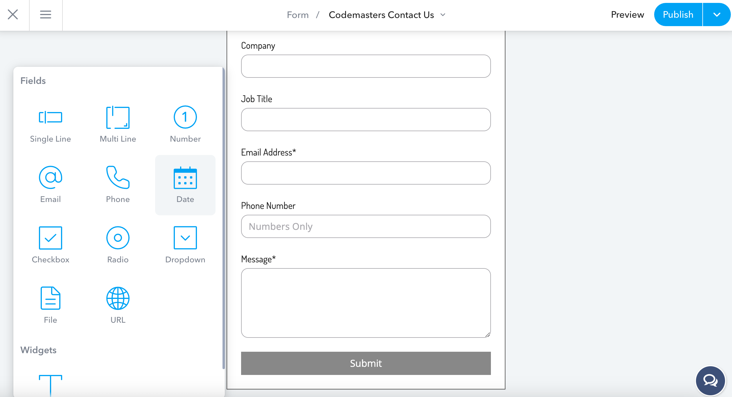
TruVISIBILITY is here to help you take your forms to the next level. Above. an example of a form being created with TruVISIBILITY's Forms app. Our Forms application provides a robust and user-friendly platform to create high-converting forms, strategically place them across your digital marketing channels, and gain valuable insights into their performance.
Contact TruVISIBILITY today for a free consultation! Let our digital marketing experts show you how our Forms application can help you capture high-quality leads, nurture customer relationships, and ultimately, achieve your business goals.
Conclusion
In today's competitive digital landscape, capturing leads and nurturing customer relationships are fundamental to achieving business success. TruVISIBILITY Forms empowers you to bridge the gap between website visitors and engaged customers. With our user-friendly application, you can design high-converting forms, place them strategically across your website, chatbots, and email messages, and gain valuable data-driven insights to optimize your lead generation efforts. Don't let ineffective forms hinder your growth. Contact TruVISIBILITY today and unlock the full potential of your forms!
Key Takeaways
1. Forms are used primarily for lead generation, market research, feedback, reviews, and event registrations.
2. You can craft a compelling form by using conversational language and keeping it brief and clear.
3. Avoid mistakes when building your form, such as adding too many fields or lacking a clear value proposition.
Small businesses, streamline your marketing with the TruVISIBILITY All-In-One Marketing Suite. Try it for free today and see the difference a unified platform makes!
Want to receive more articles?
Sign-up for our weekly newsletter to receive info that will help your business grow


