
Welcome emails have a 91.43% open rate. Pretty powerful, right? For your business, a welcome email is a mighty tool to communicate valuable ideas to your audience:
- to tell your brand's story
- to offer cool incentives
- to start building the trust and engagement of customers
- to get people to use your product
The welcome email is an opportunity not to miss, so it's got to be well-thought-out, well-structured, and well-written.
In case you are struggling with the content, ideas, or wordings to put in your first email to welcome customers, read the article for some tips and inspiring examples.
Jump to...
- How Does Your Business Benefit from a Well-Crafted Welcome Email: Facts and Figures
- 7 Tips for a Great Welcome Email
- Key Takeaways for Your Marketing Strategy
How Does Your Business Benefit from a Well-Crafted Welcome Email: Facts and Figures
What Is a Welcome Email?
A welcome email is the first email that gets sent to new subscribers. It is the first impression your company produces on the user when they sign up for your product or website. The content of welcome emails can be pretty much everything: GIFs, special offers, free bonuses, videos, or just a friendly hello to establish a new relationship.
What Is So Great about Welcome Emails?
Are welcome emails effective or not? What are they able to achieve? To draw conclusions, let's look at some numbers:
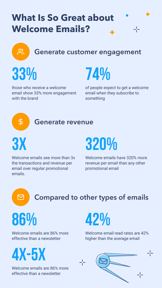
So, we have to conclude that welcome emails create lots of opportunities for your brand to succeed. Here are some of them:
Welcome Emails Save Time
Welcome emails are often (and should be) automated. Instead of manually connecting to every new lead, you can make sending the welcome message fast and efficient. Marketing automation software, like TruVISIBILITY Messaging, allows you both to build beautiful emails and send them automatically upon each sign-up.
A Good Welcome Builds Loyalty and Trust
The right welcome email could start a life-long relationship with a customer. Since welcome messages have high open, click-through, and read rates, you can create lots of opportunities for future customers to interact with your brand. For, instance, use inclusive language to create a sense of community: "Hi there, Anna! Welcome to the club".
Excellent Opportunity to Make a Sale
Including offers and insensitive to the first email will motivate the user to make a purchase faster, especially if they already got interested in your products. Even when people are not ready to buy anything from you, such welcome incentives leave a good impression.
A Welcome Email Will Gather Data for You
In this first email, ask about their preferences regarding your products and services, how often they want to receive emails, etc, and you will get powerful information about your audience that you can later use in the marketing campaign.
7 Tips for a Great Welcome Email
A welcome email will bring benefits only when it's well-written, well-designed, and well-structured. These tips and examples will help you make sure you are not making any crucial mistakes in email design.
Have a Clear Email Stricture
You have probably heard a saying that on the net, people scan and skim rather than read. A clear structure of your email, with clear headlines, allows subscribers to scan for important information and find what they need. For your brand, a good structure makes sure you get the message across. No matter what type of content you decide to include in the welcome email, whether it's a video, images, or GIFs, don't let it live in chaos, structure it.
Let's look at 2 examples of a great structure.
Grammarly

What are the strong points of the email?
- Grammarly sets expectations. Sharing information about how the product works is a great step towards building trust. It also ensures that your emails make it to the inbox and don't get marked as spam.
- The objective of each section is crystal clear to the user. Each section has a self-explanatory headline, so you aren't left guessing what the brand is trying to communicate in their welcome message. The email is easy to skim and the necessary information is easy to find.
- The email has useful links. Right from this welcome email, you can get to settings and customize the Grammarly experience or you can upgrade it to premium without having to look for the necessary page. Including useful links and resources in the welcome email means taking care of your subscribers. And they will appreciate it.
Canva

What are the strong points of the email?
- Step-by-step instructions. This is an excellent strategy for the first email if you want customers to take action or if you want to give a simplified explanation of how your product works. It's eye-catching, simple to understand, straightforward, and it shows customers you care.
- One clear CTA button. Unlike Grammarly, Canva opts for a single CTA button that pushes customers to start using the product. Some suggest that a single CTA button is better, however, we think there is no right or wrong here as long as a call to action is clear, self-explanatory, and noticeable.
- What to expect in future emails. A small footer indicates that future content will be useful, which is a great move to prevent people from unsubscribing. However, that wouldn't hurt to make this information more noticeable.
Tell a Story of Your Brand
Storytelling is one of the core principles of today's marketing. An inspiring brand story is what makes people opt for your brand when there is a choice. This story has to start somewhere, and a welcome email is a great starting point.
Use welcome emails to introduce key values of the brand and your marketing proposition. There are countless ways to tell the story of your brand. Don't be afraid to experiment with innovative ideas! Meanwhile, let's look at how other brands do this.
Monday.com
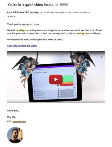
What are the strong points of the email?
- Unusual content type. We expect to find text and images in any welcome email. Guys from Monday.com, a company that produces software for teamwork planning, surprise you with a video! Let's be honest: it's too intriguing to skip.
- The catchy subject line and video title. Monday.com drifts away from basic subjects lines and invite their customers to have a more personal, friendlier dialogue.
- Humorous and touching problem-solution video. Intriguing subject lines won't do it if the content doesn't match expectations. Monday.com creates great visual content that hits all the points: it's hilarious, it connects with people on the emotional level, and it describes the problem and how their products solve it.
Offer a Welcome Incentive in the First Email
The first email is the best place to offer a welcome promo code, discount, or other forms of insensitive. It creates a connection between customers and a brand and breaks the ice of the first purchase. Here is the example.
APTO Skincare

What are the strong points of the email?
- A well-placed CTA button. It is important that a CTA button reflects exactly what you want your customers to do that it is brights and visible and that it is visible on the screen without the need to scroll.
- Attractive shopping incentive. The promo code for free devilry is just great in every way.
- Showcased company's values. APTO Skincare's welcome email is all about its core values: natural ingredients, cruelty friendly, and affordable. When your business, Like APTO, targets a very precise customer group, it's a good idea to lay it bare in the welcome email.
- Connection to the social media pages. This is a great idea when your brand is developing a social media community, where you can have a dialogue with customers and invite them to create brand-affiliated content.

Introduce Your Brand Social Media Pages
As mentioned briefly before, including links to your social media to the welcome email is another effective way to increase customer engagement. Apart from just adding links to various social media pages, there are a couple of ways to take it further:
- In the first email, offer bonuses for social engagement, for example, 10% off for a social share, or anything else of this kind.
- Following the previous example of APTO, you can add some of the best social media publications right to the email. But don't go over the top. It might work perfectly for a short Facebook post or Instagram images, but a long read might be overwhelming for customers to read.
Let's look at one of the ways it can be done.
CB2
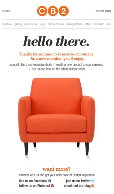
What are the strong points of the email?
- A thank you note. Saying "thank you" in the welcome message is a small yet powerful tool to start a long and beneficial relationship with a user.
- Expectations are set. CB2, a store selling furniture and home decor, teases customers by promising useful exciting content it future emails. This may decrease the number of unsubscribed visitors and increase the read rates of other emails. Just make sure you keep your promise.
- Invitation to social media. In their welcome email, CB2 casually invites subscribers to join the social media of the brand.
- No need to scroll. This is a great feature of CB2 email: it's brief and neat, however, they manage to fit all the necessary information. Sometimes we want to say so much in our welcome messages, but we forget that people don't really read. However, it doesn't mean that your welcome email must always be short. The content must deliver brand proposition and values, and depending on that, an adequate length should be chosen.
Get Visual in Your Welcome Emails
A welcome email is not a place to be shy. Show your best images, designs, happy customers, or benefits like free returns warranty.
Visual aspect is crucial in everything you do in your business, and it's especially important in a welcome email. Compare it to the first date: you want to look neat and wear your best outfit. Same here! Make the first welcome shine and stand out.
Let's take a look at well-worth marking efforts.
Home Chef

What are the strong points of the email?
- Great visual content. Home Chef is a brand that delivers weekly meal kits customized to your liking. The business strives to make your food diverse and interesting. The visual content they put in their welcome message fully reflects their brand proposition: those dishes look like they come from a restaurant menu, but you'll be able to make them at home! So, visual content delivers perfectly on brand.
- A well-placed CTA button. Most of the time, a welcome message has a CTA at the end of the email, and it's only visible when you scroll down. In this email, CTA is right at the beginning.
Adored Vintage
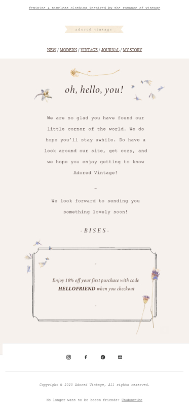
What are the strong points of the email?
- Welcome discount. As we've discussed before, everyone loves welcome incentives. They build relationships with the brand and make it easier to complete the first purchase.
- Charming tone. Another step towards building closer relations with customers. Notice how tone reflects the overall brand's style and image: it's friendly, yet gentle and cozy.
- Adequate visual content. To add to the image of vintage elegance, femininity, and tenderness, this email uses appropriate design: pastel colors, typewritten font, and other small details. We can admit that it works!
No CTA Button? You might have noticed that the welcome email from Adored Vintage doesn't have a CTA button. In their welcome message, it seems like the right thing to do, as a big aggressive SHOP NOW CTA wouldn't go along with the image Adored Vintage is trying to create. However, we do believe a CTA button is necessary for any welcome email. You would just have to design it appropriate to brand image and marketing strategy.
Use a Catchy Welcome Subject Line in Your Welcome Email
Don't underestimate the power of subject lines in your welcome message. When you get an email, a subject line is the first thing you see and it adds a great deal to the impression you get.
There are a couple of simple yet effective subject line examples that many companies use. It's never a bad idea to borrow them and adjust them to your brand. We looked at dozens of welcome emails, and here is what caught our attention:
- Hi, Anna! Welcome to the club 💛
- Welcome to [brand's name]. There is a great offer inside!
- Hello, Anna! Your welcome offer expires soon.
- Welcome to [brand's name]. Take $20 off your first order.
- Welcome, Anna! Thank you for signing up.
Well, you got the idea. This is one of the ways to go about writing your welcome email subject line: simple, friendly, straightforward.
There is also another way: create a unique subject line that will deliver on brand. Let's take a peek at the example.
Food52
![]()
What are the strong points of the email?
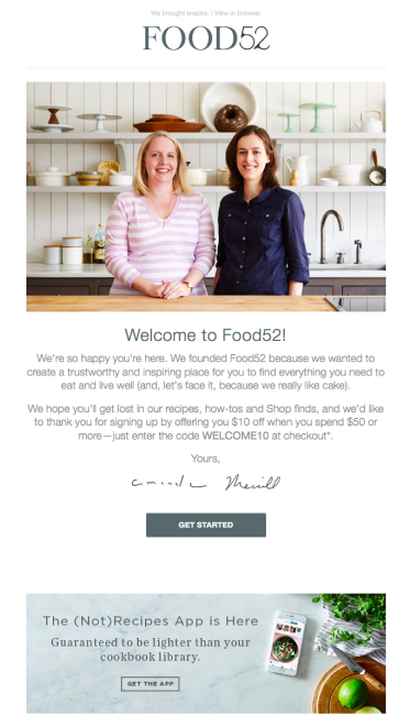
- Amazing subject line "We brought snacks". The tiniest details usually add the most to the brand's image. This subject line shows the brand's humorous and caring personality right away.
- Business proposition. Although this email is brief, it manages to fit lots of things, including the brand's value proposition. The way Food52 words it is sincere and heart-warming, so their welcome message creates an instant connection between the brand and customers.
- A touch of humor. Humor is one of the best marketing tools. Food52 makes it part of their image by including a funny subject line and a small joke along the lines of their welcome email.
Send a Series of Welcome Emails Rather Than a Single Email
According to Omnisend marketing research, a series of welcome emails generates 90% more orders than a single welcome email. When done properly, a series of welcome emails is a great opportunity to tell subscribers more about your store or products and ultimately get more revenue.
How to do a welcome email sequence?
There is no single best formula for a series of welcome emails. However, there are some general suggestions:
Each email should focus on one topic
There is no point in writing a bunch of emails if they all talk about the same thing. You should have a strategy of what message you want to convey in each email. For example, here is what a series of 3 emails might look like:
Email 1: Welcomes and thanks your subscribers. Tells what your brand is about, offers a discount or a free delivery.
Email 2: Tells a brand's story. Introduces some user-generated content on the brand's social media.
Email 3: This email might present reviews and testimonials from happy customers.
Welcome email series is sent within 3-5 days of the sign-up
The interval between emails should be neither too long, nor too short. Ideally, you want to send the first email right upon the sign-up. The second welcome email could be sent within 1 day, the third – wait for 2-3 days. This way, you won't be too annoying and you won't let your subscribers forget about you.
Let's take a look at the example of an email series from Thistle Farms, a brand that sells self-care products.
ThistleFarms
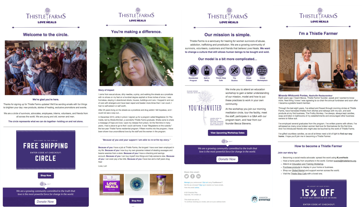
A series of welcome messages containing 4 emails are well-designed and well-written.
The aim of the first email is to thank new subscribers, set expectations for future emails, and offer a free shipping deal.
The second email tells an extremely touching and personal story. Through stories like this, you create a sense of community and you can show how your products make a difference in the world. It's well known that stories connect people, drive people to action, and evoke an emotional response. So, always consider if you can turn your marketing strategies into a story.
ThistleFarms has a powerful mission, and they share its details with their subscribers in the third email. This welcome message has other useful content: ThistleFrams invites their subscribers to an educational event, where they can connect more with the brand.
Did you notice how each email has a clear headline and a bright CTA button?
The fourth email again tells a personal story and invites subscribers to join the ThistleFarms community. By this time, you are already aware of their purpose, mission, and the difference this business makes. You've gradually become familiar with the brand and most likely have had enough time to decide if you want to be a part of this community or not. Now, completing a purchase seems just as natural.
Key Takeaways for Your Marketing Strategy
As you can see, there are loads of strategies, tools, tips, and ways to design your welcome emails. There is no right or wrong, best or worst. Most importantly, a welcome email should show your company's personality and values. It is funny? Is it professional? What do you believe in? How do you make people's lives better? What's your story? Only then can you think which type of content will reflect best those values, beliefs, and propositions in your welcome message.
When the welcome email is aligned with the brand's personality and marketing strategy, and shows politeness and care to subscribers, it will do the trick.
Luckily, there is software that will help you implement your great ideas and will make the process of creating welcome emails simple and fun – TruVISIBILITY Messaging. It allows you to design beautiful emails, have different emails for different customer segments, and automate your marketing campaign.
Get a free account to try other Messaging features!
Want to receive more articles?
Sign-up for our weekly newsletter to receive info that will help your business grow


